Let her paint an inch thick
If you haven’t been paying close attention (or you happen to be one of those backwards, curmudgeonly console players), you may have missed the boatload of new tile art going into 0.7. New dungeon! New monsters! New trousers! By my count, there were almost 300 modified or added tiles in this release.
This post is an overview of what you can expect to see when you start playing the shiny new version in a week or few.
A lot of this art has come from the ever-prodigious Poor Yurik (who you can thank for the new dungeon look, the spriggans, the kobolds, the goblins, the fabulous elephants, &c &c). However, there’s also a ridiculous amount of thanks for Denzi, coolio, Porkchop, LoginError, minmay, KiloByte, and others as well.
New Dungeon Tiles
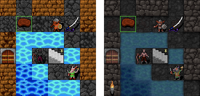
The most immediate change that you will see in 0.7 is the new look for the main dungeon. Although it may look very grey at first blush, the desaturated colors on the walls and floors are intended to give the monsters and items a much more visible pop. This next picture is a comparison between how the main dungeon looked in 0.6 and how it looks now in 0.7.
It’s not just the tiles that have changed, though. There’s a few other code changes that make the new dungeon look even better. The left side of the following image is what 0.7 would look like if only the tiles had changed. The right side is what 0.7 actually looks like with the code and tile changes.
“Spot the differences!”
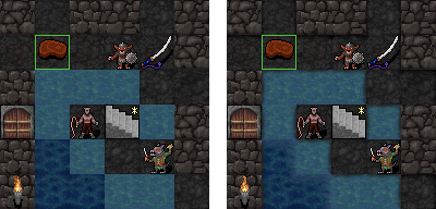
They’re all subtle, but there are three separate things going on in the picture on the right. First, like the water in the Shoals, there are transition wave tiles between shallow and deep water. Secondly, where ground touches water, there are some very thin transition shore tiles. Finally, shadows are added around walls to make them stand out as if they were lightly embossed.
One unexpected bonus from the new water tiles is that the previously garish 0.6 swamp is now a lot easier on the eyes in 0.7.
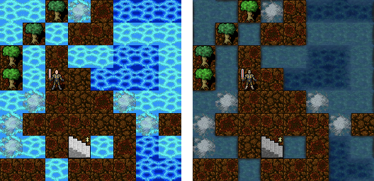
Finally, keep an eye out for the future! Poor Yurik has some great ideas about making the dungeon look even better that already have me excited for 0.8.
New Monster Tiles
A ridiculous number of monsters have gotten a facelift in 0.7. Here’s a quick comparison chart between old and new awesome.
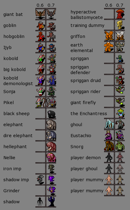
There are also a whole lot of awesome new undead tiles for 0.7. The previous version only had two types of skeletons and zombies and only one spectral thing tile which made it nearly impossible to tell them apart.

To help you sort out which new monster tile is which, you may want to use the new “monster list” in the tiles version. You can find the monster list by clicking on the monster tab underneath the inventory and spell tabs. This will show all the monsters in view, sorted by difficulty.
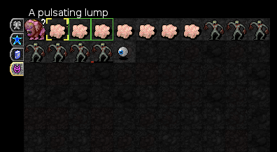
Mouse interaction with the monster list functions just like mouse interaction with the dungeon. In other words, you can left click on the monsters in the list to move towards and attack them or right click to describe them. You can also zap spells, evoke wands, or fire quivered items using shift, ctrl, and alt key modifiers. It’s super convenient!
Trousers!!!
There’s one final change in 0.7 that I’d like to take the time to point out. After thousands tens of player complaints and bug reports, this critical issue has now been addressed.
Dignity is no longer an obstacle in the search for the fabulous Orb of Zot—players now enter the dungeon wearing not just pants, but trousers.

1. Comment by hackum
12/Jul/2010 at 18:34
Awesome as always!
2. Comment by HANS
12/Jul/2010 at 18:39
holy macaroni
3. Comment by Jeff
12/Jul/2010 at 19:18
PANTS!
4. Comment by Tiedyemike
12/Jul/2010 at 19:33
Desaturating the dungeon a bit I can understand, but does it have to be so dark? In a well-lit room, it’s hard to tell walls from floors.
5. Comment by JMA
12/Jul/2010 at 20:06
No, really. I am serious. You guys are the BEST roguelike around.
Thanks for all your hard work!
6. Comment by JimmyDietCoke
12/Jul/2010 at 21:19
Looks great, but I’m totality with Tiedyemike, it’s very hard to see the difference between the walls and floors at a glance now, and nearly impossible to see the darkened explored parts outside your direct line of sight.
7. Comment by RBL
12/Jul/2010 at 22:28
I haven’t been this excited about a roguelike since NetHack 3.4.3 was released. Thank you for many wasted hours.
8. Comment by Mongrol
13/Jul/2010 at 00:25
The new tiles look awesome. Isn’t ordering the monster list by difficulty a bit of a spoiler?
9. Comment by Markosias
13/Jul/2010 at 01:51
Beautiful! Thank you Poor Yurik for the fantastic job! I’m looking forward to making some great zombie hordes ^^
10. Comment by purge
13/Jul/2010 at 02:02
Amazing write-up Enne! Very nice work on the charts and screenshots!
11. Comment by Jaega1
13/Jul/2010 at 05:18
AWESOME guys! I downloaded Trunk after seeing this and the visual improvement is so awesome. It gives the game a very dark and creepy feel but I for one think that it is great. Keep up the great work!
12. Comment by Poor Yurik
13/Jul/2010 at 11:36
Thank you guys for all the feedback (+ and -) on the new art…not just on here, but on irc, on SA, etc. A second set of eyes can be a huge help after working on a set of tiles for a while, but a few dozen sets of secondary eyes is even better. I brightened the walls a bit, and you can play with the updated tiles in the latest development build. Again, thanks guys, and have fun.
13. Comment by N
13/Jul/2010 at 14:57
A bit divided here. I like the new ones but the lack of contrast will require double of eye effort when exploring the gloomy corridors. Anyway great work guys.
14. Comment by Chairman Poo
13/Jul/2010 at 15:08
I love the new tiles too.
Also, I dont know if it’s the right place to point this stuff out, but I am playing 0.7 atm, and for some reason I can’t invoke wearable items, such as invisibility rings and whatnot.
15. Comment by M
13/Jul/2010 at 15:11
These look nice :)
I would love to see an option in the non-tile version to get the kind of colours and display that the dos builds used to provide. It was so much nicer to read and look at, and the screen space was used a lot better.
I like the tile version, but I miss the dos console look :(
16. Comment by vicvegax
13/Jul/2010 at 17:05
oh guys, that’s great!
good and even better… tnx
17. Comment by Epitaph64
14/Jul/2010 at 01:14
Wow, the new first area tiles really improve the atmosphere of the game. Plus, new players who rarely see the other areas of the game until they get better at it will have a better impression of it right off the bat! Thanks everyone who works on this game and continues to improve it.
18. Comment by KiloByte
15/Jul/2010 at 12:44
I’m afraid that the dark-gray on black color scheme makes it impossible to see anything during the day, it might be better to crank up the contrast.
19. Comment by agentshags
15/Jul/2010 at 21:13
will there be an option to use the previous tileset? that would be pretty cool. ascii + two tilesets….
20. Comment by supulton
17/Jul/2010 at 14:25
The new tiles look amazing. Yeah, it could use some brightening up, but all the new monster details are really superb. Also thanks for toning down the water tiles, the contrast gave me seizures.
21. Comment by Leon
21/Jul/2010 at 05:36
I like the new tiles overall, but the new door looks a bit too grayish.
22. Comment by James
24/Jul/2010 at 01:12
Neat tiles, but it’s harder to see things. It’s not just telling the walls from the floor, there’s also how all things goblin and koboldish look really similar now. Even previously distinct poses have been changed to be more samey.
23. Comment by John
28/Jul/2010 at 23:14
I echo the remarks about the contrast. On a mac, the latest version really gives me fits telling apart walls and floors. Plus it seems to me that the mini-map is smaller and less distinct also. Otherwise I heartily approve of all of the changes!
24. Comment by eobet
15/Aug/2010 at 22:20
I only found this out today… in light of having recently played Minecraft, the old more basic tiles enables your mind’s imagination to work a lot harder than what these new, more detailed dungeon tiles do.
The more detailed it gets, it’s easier to see the flaws rather than the possibilities:
* The sheep looks more like a gorilla.
* The new shadow imp looks like a complete wimp, unfortunately.
* The new ghoul as well, he’s shrunk and lost all menace.
* Snorg same thing, a fat blob instead of a huge troll with tree trunks for arms and legs.
* Finally, the shadow has become something from a disney movie, and also ignored the perspective of the rest of the tiles by grounding himself firmly to the bottom row of pixels.
I can’t say I miss the old water tiles, though…
25. Comment by kristi
4/Nov/2010 at 02:20
I’d really like an option to use the old tileset. My vision’s a bit poor, and I found the crisp high-contrast of the earlier version made things much easier to make out.