Console readability changes
Today on starting a new Trunk game on CDO I noticed the console interface has changed colours A LOT. This reduces the amount of visual information available. Blue and green script has been made grey. Unnecessary stuff got bright yellow highlighting. That seems like a bad idea, given that console needs to be supremely readable. Monsters that were previously of a clear bright colour are now a less bright colour (Ice beast, I think). Can I have an option please to change that back? This is much worse for speedrunning.
b
Notice that quiver and weapon wielded are now grey. The ingame-useless character name and title are now bright yellow, highlighting it. The font and colour of monster warnings is different. Out of view floor tiles are now grey instead of blue. I cannot stress how much worse this is in terms of quick readablity and user interface sophistication. You want to visually have important stuff be noticeable and have unimportant stuff be not noticeable. This does almost the opposite.
Apparently we now get monster danger indicators (green/yellow/red) script, which is good! But not at the price of the rest of this. Also, no screenshot of this, distracted monsters now get the brightest indicator in the entire game, yellow background! Its the most unimportant monster status in the game! Its just not that relevant, give me yellow background for hasted or immune to poison or anything else.
Most console users are longtime users. I and other old hats had years to get used to current interface, its really really good. This new one is almost a study in how to not do it.
Yes to new monster info like danger interface or polearm status (which is still pretty fresh!), no to almost random colour/status/fonts(!!!?) changes.
- Old.png (97.16 KiB) Viewed 3142 times
b
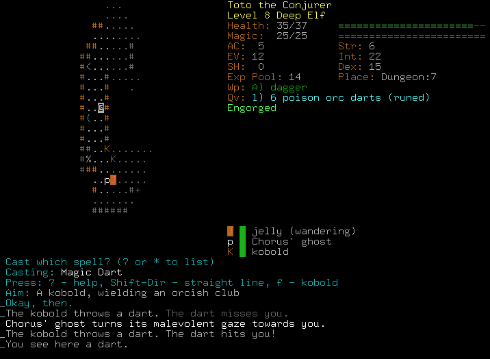
- Trunk.png (109.02 KiB) Viewed 3142 times
Notice that quiver and weapon wielded are now grey. The ingame-useless character name and title are now bright yellow, highlighting it. The font and colour of monster warnings is different. Out of view floor tiles are now grey instead of blue. I cannot stress how much worse this is in terms of quick readablity and user interface sophistication. You want to visually have important stuff be noticeable and have unimportant stuff be not noticeable. This does almost the opposite.
Apparently we now get monster danger indicators (green/yellow/red) script, which is good! But not at the price of the rest of this. Also, no screenshot of this, distracted monsters now get the brightest indicator in the entire game, yellow background! Its the most unimportant monster status in the game! Its just not that relevant, give me yellow background for hasted or immune to poison or anything else.
Most console users are longtime users. I and other old hats had years to get used to current interface, its really really good. This new one is almost a study in how to not do it.
Yes to new monster info like danger interface or polearm status (which is still pretty fresh!), no to almost random colour/status/fonts(!!!?) changes.